Qualitative Analysis
The image below shows the input images that were unseen during training and rendered 3D models from the poses predicted by the trained network. The alignment between the input images and rendered 3D models shows that the network is learning to predict poses that are close to the actual poses from which the images have been captured.

Quantitative Analysis
We quantify our model by measuring errors in the translational and rotation components of the pose. We quantify the error in translational error using RMSE and rotational error using cosine similarity between ground truth and predicted quaternions. The metrics are defined as follows.

| Metric | Value |
| Position Error | 1.44 meters |
| Angular Error | 5.38 degrees |
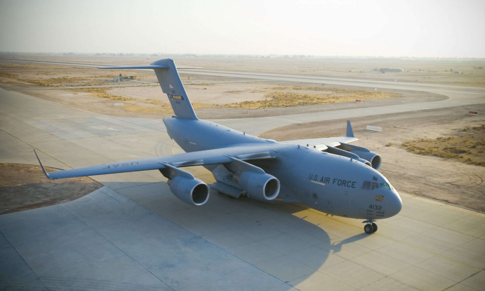
The table above shows the metrics computed on the unseen validation dataset. The position and angular errors are a fraction of the size of the C17 aircraft which is more than 50m long.
Inference
Since the model is a prototype of a model that will be used in commercial applications, we measured metrics relevant to the deployment of the model. The table below shows the metrics.
| Metric | Value |
| No. of parameters | 21.3 |
| Inference time | 2.7 ms (at full precision on RTX 3090Ti) |
| FLOPS | 38.4 billion |